AWARE
SPECULATIVE DESIGN
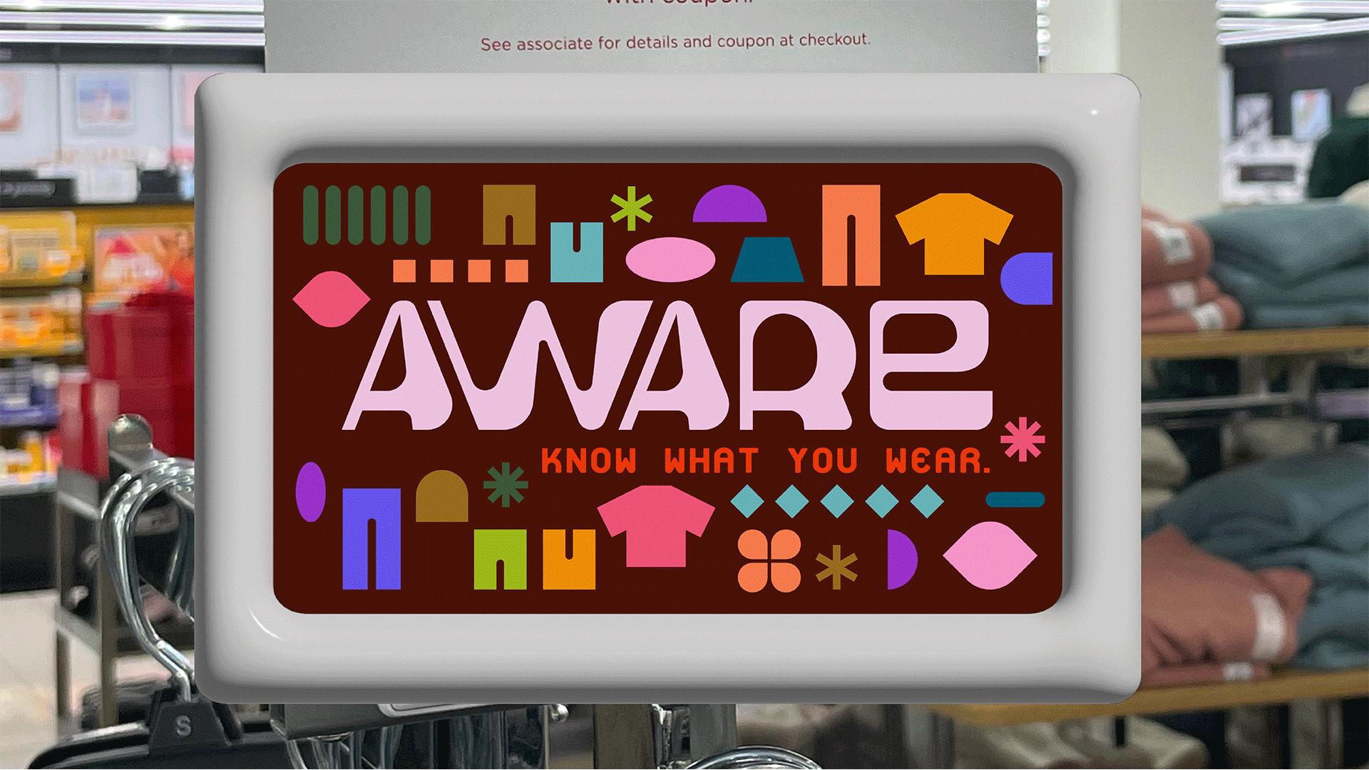
SCREEN (APP & TABLET)
FIGMA / ILLUSTRATOR
While fast fashion and its impacts are becoming more universally known, it’s still not in the front of most consumers’ minds as they shop. Both the retail industry and consumers have crafted an unrealistically limited environment where price is one of the biggest factors in buying decisions. People are constantly wanting more for less, regardless of quality, to keep up with constantly changing trends and “need” for newness. This solution combats the raging shopping industry by targeting the individual consumer, hoping that small changes can grow into an influential call for reform on a larger scale and stop the cycle of overconsumption.
AWARE is a speculative solution to fast fashion that eliminates the tedious struggle of searching for products’ ethical and environmental information by bringing transparency to supply-chain movement. It strives to create a fun and easily digestible pathway of information that is accessible to even a non-conscious consumer. Currently, it encompasses a database that collects and rates information from products’ supply chains that are shared with the consumer via an in-store tablet and app, allowing the users to make real-time decisions about their buying habits.
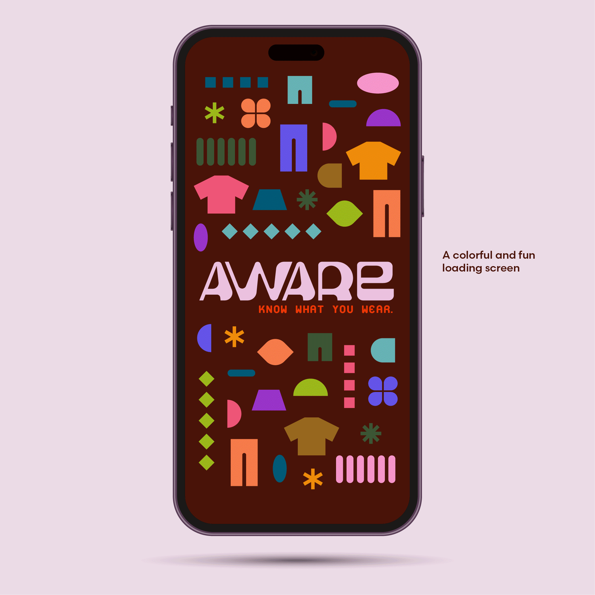
Many of the existing logos in this field center on being clean, chic, and green (environmentally) but end up being underwhelming. AWARE seeks to uphold these themes but transform them to fit their younger audience. This wordmark uses interesting, geometric letterforms to propel the viewer through its composition in an energetic journey that mimics the sporadic path of a product in the supply chain. The thick, dynamic forms embody a confrontational tone and are contrasted with rounded corners and counters that give an inviting spirit. The wordmark balances contemporary and fun while still allowing for an informative air. The tagline speaks as a statement of determination of the brand, to present correct information to promote informed decision-making, as well as a confrontation to the shopper, calling on them to question their current ability to know the ethical and environmental impact of their purchases.
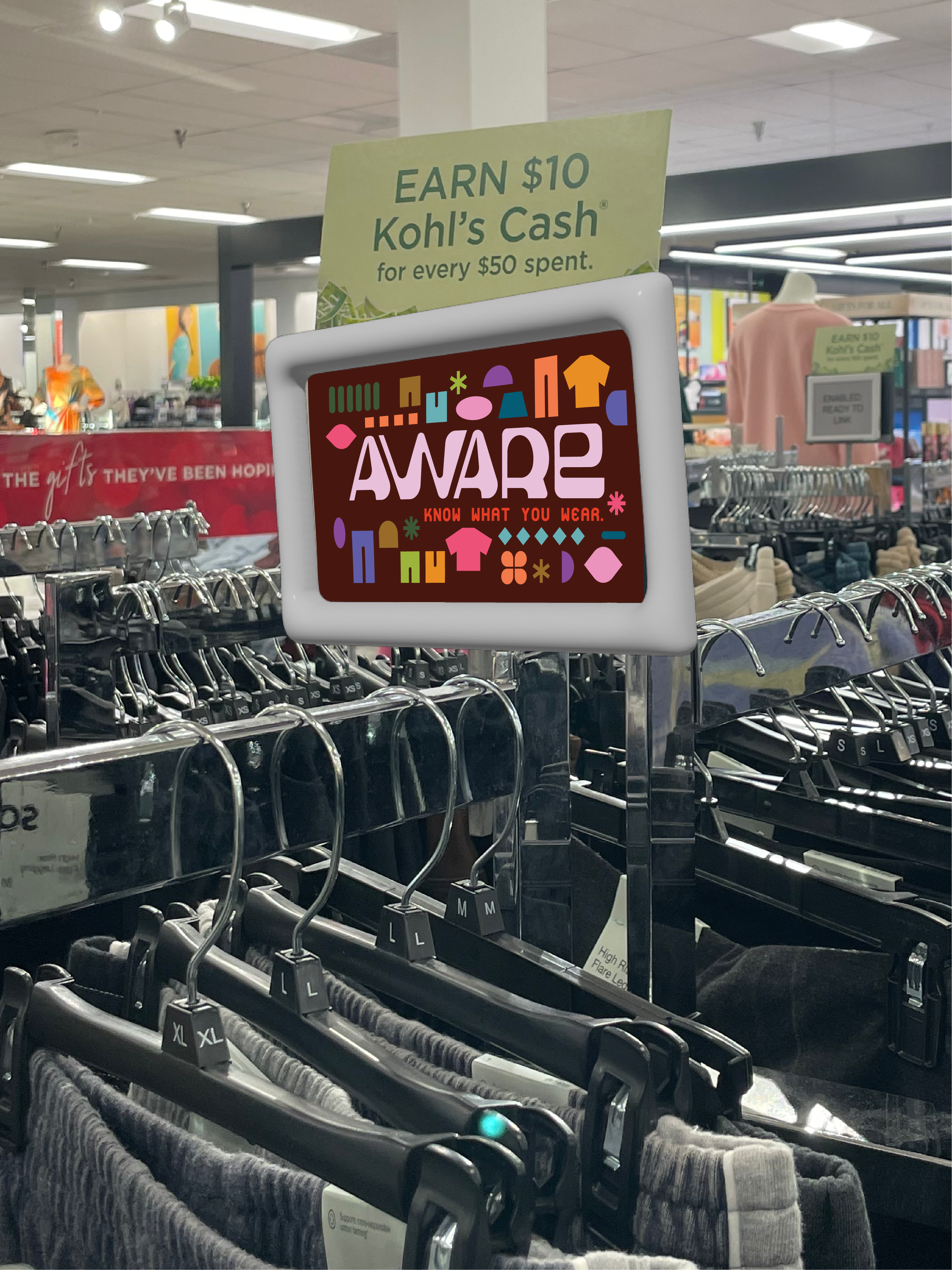

The primary colors revolve around hues of red–the most common color associated with warnings and alerts. Using this color attracts the viewers’ attention while maintaining a sense of seriousness. In another sense, vivid red is historically associated with sale and clearance signs, making it a strong focal point for shoppers’ perspectives. The typeface Platelet OT is used to complement the wordmark and as subtitle text; it is a monospace typeface that was created to solve various problems in existing monospace designs, embodying the solution of a better future that AWARE seeks to promote through its history and futuristic style. Scandia, used for body copy, is a geometric typeface that complements simplistic accenting shapes and creates balance against the wordmark and Platelet typeface.