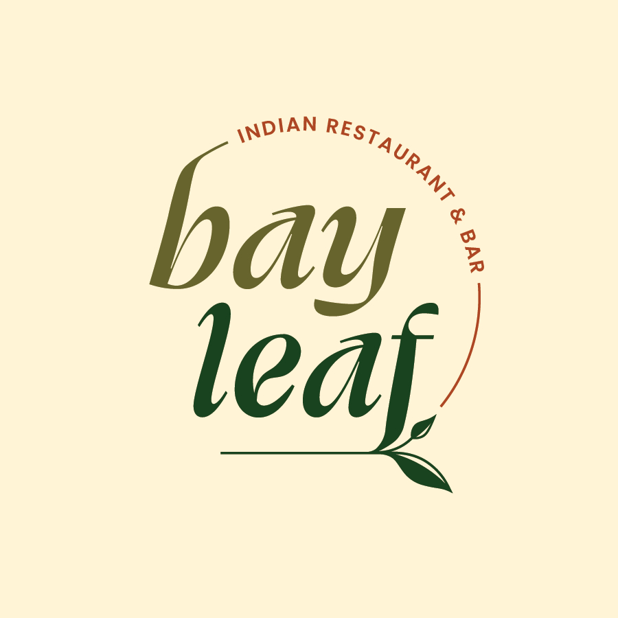
BAYLEAF INDIAN RESTAURANT & BAR
BRANDING & IDENTITY
LOGO / PRINT (5.5” x 11” MENU) / SCREEN (INSTAGRAM POST)
INDESIGN / ILLUSTRATOR
Bayleaf is a new Indian Restaurant in Downtown Peoria. Among the dining options in the area, it stands out in cuisine and environment. Originally a Broadway lounge, the space has high ceilings, a raised stage in front of tall windows, and a balcony that overlooks the main floor. The space is equipped with a lighting and sound system making it perfect for hosting Jazz nights or Indian DJs. A long bar stretches across one wall in the original deep-colored, wood from when the building was initially built in 1916. It currently exists as a separate entity with plans to combine once the restaurant gets its footing.
Old logo:
This logo and identity seeks to create a cohesive digital and physical presence that portrays its classy but exciting atmosphere. The display type is created using the typeface Swear from OH no Type Co. This typeface has a specific font called “cilati” (“italic” spelled backwards) which reverses the areas of thick and thin on an italicized character to create type that is widely expressive but still very readable. The more organic forms parallel the vibrant atmosphere of the bar and its drinks. From this, a few ligatures have been altered to add more movement and interest based off some preliminary sketches: the crossbar of the “e” has a more dramatic curve, an arm was added to the “a”, and the terminals of “b” and “f” were changed to flow with the design. The supporting text uses an international typeface created by the Indian Type Foundry; it has both Latin and Devanagari characters, the primary script in India, which gives the restaurant an option to implement bilingual information. The geometric structure of the font supports the display type and nods to the more industrial interior of the restaurant.
The bay leaf is used universally but is specifically prominent in Indian cuisine. In any dish, it adds a key, distinct level of flavor through both taste and aroma. It also works to balance richness by adding a slight bitterness and acidity. While the name comes from the ingredient used in the restaurant’s dishes, it can also relate to the bar’s intricately crafted drinks that are thoughtfully created to complement the dinner. The circular primary logo subtly calls to the shape of a cup’s rim–what a patron would see as they enjoy a drink–and iterates the “fullness” or balance of flavors that can be experienced. The deep orange and varied green color palette are inspired by the earthy, bold flavors used in both the cuisine and the cocktails, and the warm background emulates the atmosphere of the dining and drinking experience.


