CROSS-CULTURAL LETTERFORMS
TYPOGRAPHY
26-LETTER ALPHABET / NUMBERS 0-9
ILLUSTRATOR
These letterforms were created as part of an experimental practice led by Archana Shekara to promote cross-cultural awareness. Their inspiration comes from motifs or essences of two items from different cultures–in this case, the cultures are Indian (Archana) and Chinese (myself). The overall design is heavily inspired by the Chinese knot; though historically used as a tool for counting and exchanging messages before writing became a practice, today, it is used as a good luck charm–signifying love and friendliness–or as accessories and decorations. They are found in many different colors and knots, but are most commonly red, Pan Chang knots (square diamonds with loops around the outside). I was specifically inspired by their intricate weaving and formation using a single cord. The Indian counterpart that I took inspiration from was a teardrop shape from a bindi–a decorative mark on the forehead that can be made of paint or jewels. Traditionally, the bindi is worn in between the eyebrows, or slightly above, where the third eye chakra sits. This area is believed to be where energy is concentrated and connects to the soul of a being. The teardrop is also a symbol of luck in Indian culture and symbolizes fertility and auspiciousness.
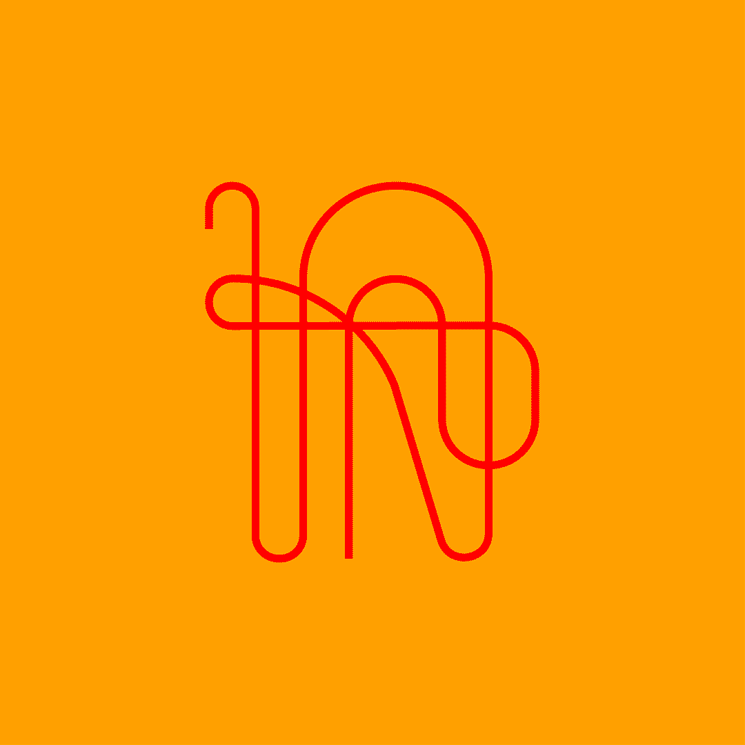
These letterforms explore the dimension and overlap similarly found in the Chinese knot. The lines are largely simplified compared to the intricate path of the string, but they flow and curve in similar geometric directions while maintaining some unexpected and exciting movement, playing off the idea of luck. The teardrop shape holds emphasis at one end of the line like a serif and draws the eye back into the composition towards the open end. It acts like a midpoint in the same way that the top of the Chinese knot is usually a loop, and the ends hang together from the bottom of the knot.

SKETCHES


